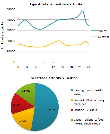
The graph below shows the demand for electricity in England during typical days in winter and summer. The pie chart shows how electricity is used in an average English home.
Summarise the information by selecting and reporting the main features and make comparisons where relevant.
Summarise the information by selecting and reporting the main features and make comparisons where relevant.
You should write at least 150 words.

Model answer
The Demand for electricity in England during typical days in winter and summer is illustrated in the graph. The use of electricity in an average English home is shown in the pie chart. From the graph it is generally obvious that the demand is in its maximum around 2100 in winter times and in its minimum around 400 being almost constant between 1200 and 2100 in winter times. During summer times on the other hand the demand reaches its top point around 1300 and the bottom point around 900 being almost constant between 1550 and 2000.
In wither times the curve gradually increases to reach 40000 units of electricity by 3 o’clock in the morning. This is followed by gradual decline to its lowest limit of 30000 units at 9 o’clock. A gradual rise is obvious again to reach a stationary level between 3 o’clock and 9 o’clock of about 40000 units again. Then there is a sharp rise in the next hour to reach its maximum before collapsing again to a lower level by the end of the day.
In summer time the curve gradually decrease to reach its lower limit around 9 o’clock of a bit more that 10000 units. A gradual increase is noticed to reach its top of 20000 after which a stationary phase is obvious between 3 o’clock and 10 o’clock at night of about 15000 units.
The pie chart on the other hand shows that 52.5% of the electricity is used for heating rooms and water. 17.5% is consumed for ovens kettles and washing machines 15% is used in lighting TV and radio and finally 15% is consumed in the sue of vacuum cleaners food mixtures and electric tools.
